Big Data isn’t just owned by Big Business.
In keeping with the blog motto “Bringing Big Data to the People”, check out Google’s free mass quantities in technicolor dolby. Explore your world as seen in the data.
Google’s Public Data has over 100 sources (and counting) that provide a variety of data stores from world perspective to national focus. These aren’t spreadsheets or power points, each page is an uber-rich interactive visualization of how the data lives. Not sure about the content? Be sure to try all the bells and whistles in the legend right, the menu left, and the settings above. This is data made for YOU to manipulate easily.
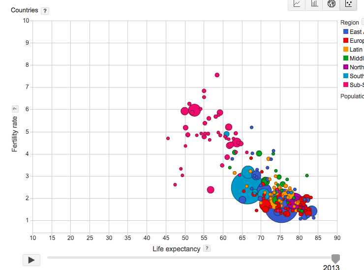
World Bank Plots Fertility versus Life Expectancy
The World Bank provides a wealth of information of how life expectancy and fertility rates plot. Hit play to watch 1961 fly into today. Spoiler alert, everyone slides down and to the right – lower fertility and longer life expectancy. Mouse over the continental legend to see each in isolation or mouse over the graph itself to see the individual country’s action.
Head to the left margin to manipulate several categories within the data. Separate out individual countries to compare, or see how different income categories move.
Try selecting female or male as the X axis and watch several players “bounce” off the Fertility and Life expectancy walls.
World Health Organization and Harvard Medical School
From wealth to health, this data plots the outbreak of infectious diseases. This data is interactive, but perhaps a little less maneuverable. The zip through time makes it difficult to appreciate, let only comprehend, the data movement. With that perspective, it’s better to switch to the 2-D line graph.
The left margin parses out timeliness – average time to outbreak discovery and average time to public communication – is best viewed as bar charts. Run that time schemata, and you can see how the regions responded during different periods.
Eurostat and European Employment Looks
From world perspective to European focus, this chart shows how bar graphs with time phase can highlight specific countries against the broader European data set.
The A’s Don’t Have It
Utilizing the US Census Bureau, this data walks through state revenues. The four state’s beginning with A linger at the bottom. Add Texas, New York and California and watch the disparity gap from the pack. Try each revenue source – liquor store, insurance, and general – and see the bouncing balls. 2007 really slings around the bigger balls, but smaller players swayed less.

Still thirsty?
You can ask Google for public data and find 833 MILLION results. Datafloq – as always – provides an awesome assessment of public data availability. Start with their list to get an awareness of the possibilities.


